
What makes a bad painting?
Stupid reviews. Radiohead. Exceedingly slow linocutting

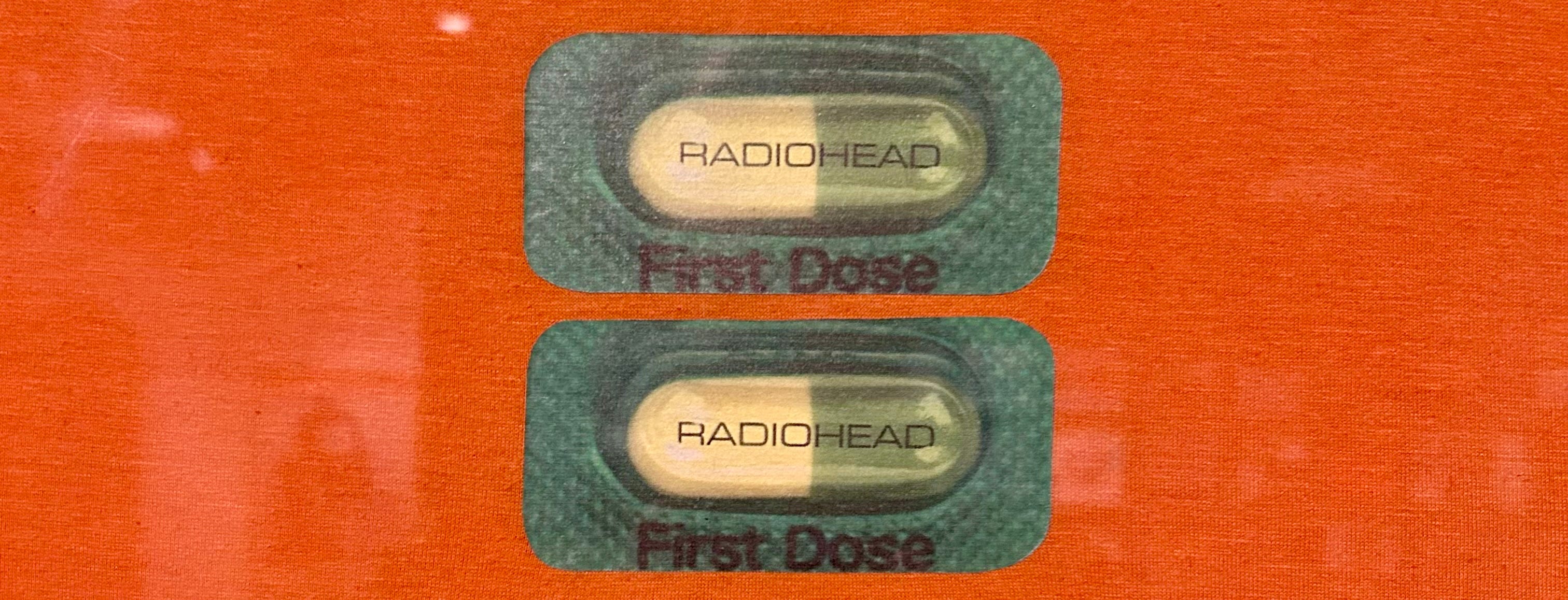
Radiohead are on tour again for the first time since 2018, which, in my aged state, seems to be about yesterday. I’m not going because it seems prohibitively expensive, and I have already seen Radiohead when I lived in Oxford. This surprised my son who is very much enamoured of Radiohead himself right now, because there is no large music venue here, but it was a sort of festival deal in South Park. He asks if Cartman was there sarcastically, and I tell him no, he’s on the t shirt, because when Trey Parker found out, he wanted to design the T shirt. I still have that shirt; a friend didn’t get tickets so I kept it pristine to taunt him with it from time to time. Apparently it’s worth 180 quid now.
I’m not prepared to pay huge amounts and travel to see Radiohead anymore, but I was full prepared to trot myself off to see ‘This is What You Get’, at the Ashmolean, a collection of work by Stanley Donwood in collaboration with Thom Yorke. This seems mostly well received as an exhibition unless you work for the Guardian. The Guardian review was titled ‘a succession of bad paintings’ in a review that so comprehensively missed the point I can’t stop thinking about it. ‘A sucession of bad paintings’ as a title is in itself an odd take when most of the things there weren’t paintings. The main gripes were the paintings were bad; that they wouldn’t be exhibited if Radiohead weren’t popular, and they didn’t deserve to be in a gallery like the Ashmolean.
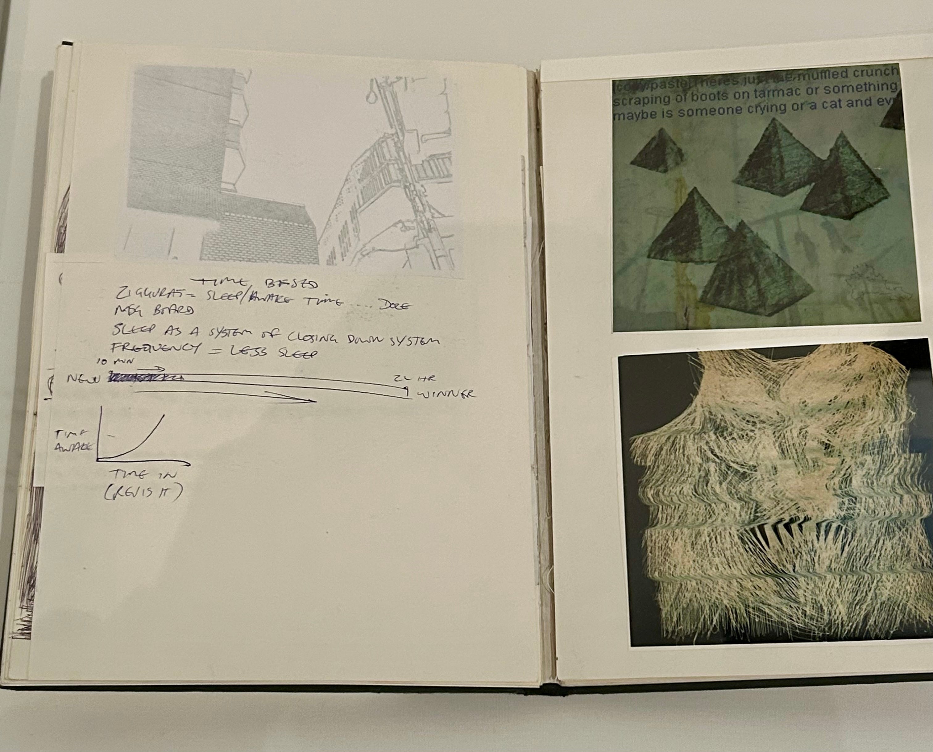
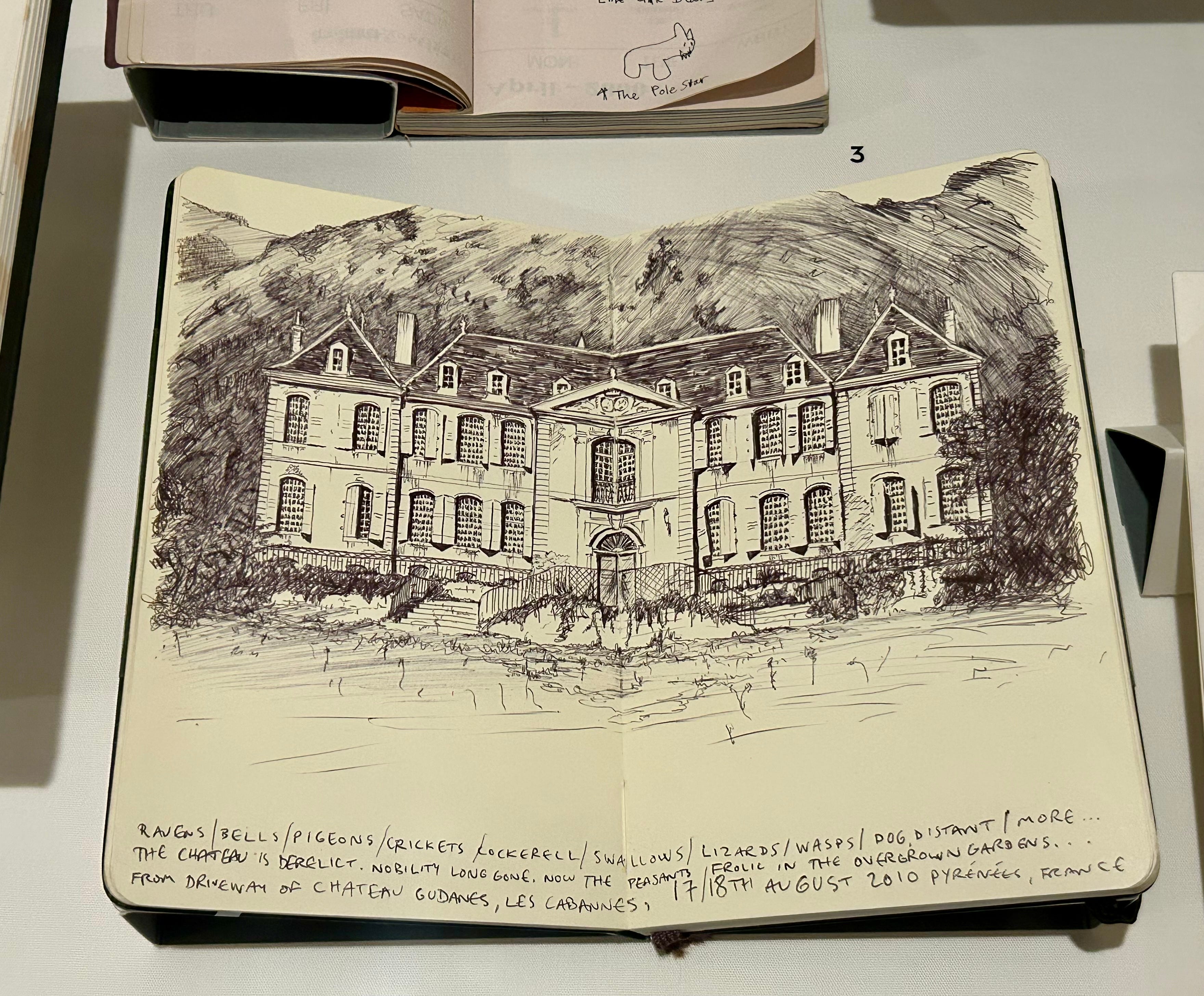
That last arguement might hold up slightly if the exhibition were in the dedicated art gallery like Modern Art Oxford, but the Ashmolean isn’t a gallery. It’s a museum- though many of the paid exhibitions are art, there are other culturally relevant exhibitions that enough people would want to go see to make it worthwhile financially for the Ashmolean to host them, for example one about witchcraft I saw several years ago. Since local band Radiohead are sufficiently culturally relevant that people will travel to Oxford and pay quite a lot of money to have a look at Thom Yorke’s notebooks, the Ashmolean seems an ideal place for this exhibition, which includes album covers, audio clips, ephemera, interactive displays, printmaking plates and most of all sketchbooks.
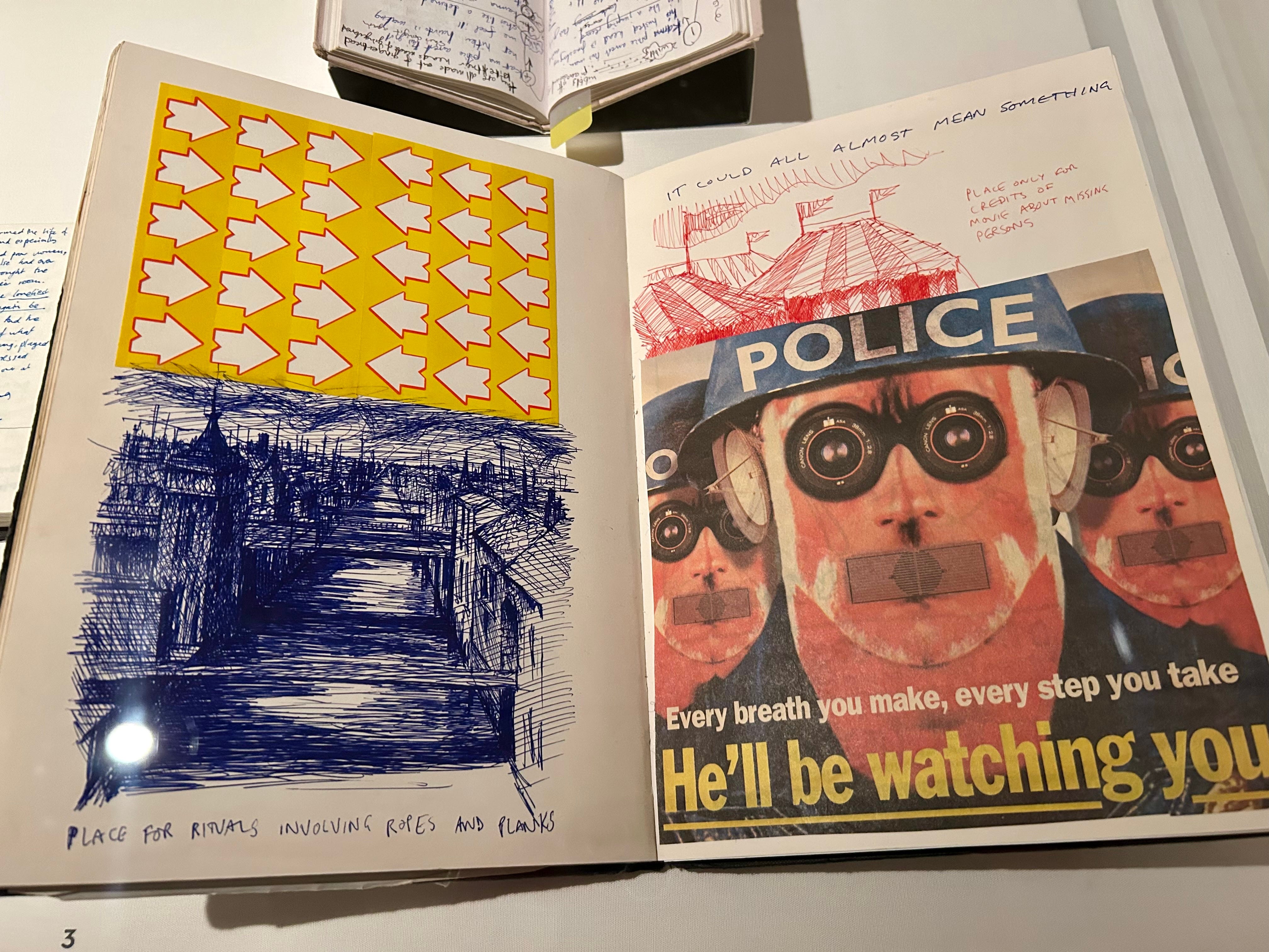
Lots and lots of sketchbooks
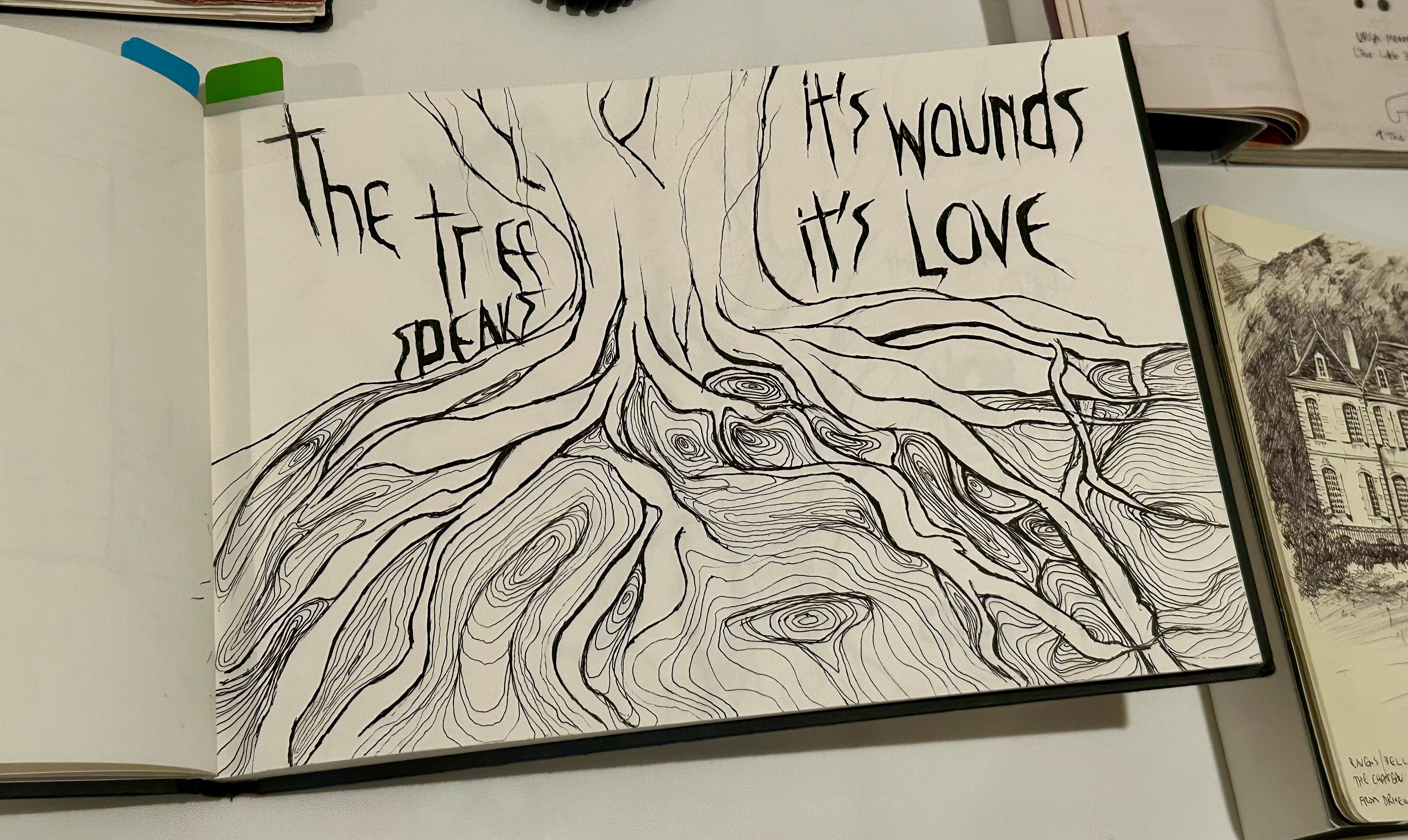
You know how I love sketchbooks. It think I love the workings out more than the actual works. I came out with so many ideas for my own sketchbook practice. I always get to enjoy exhibitions on two level; to enjoy the things on display, but also to steal ideas to ferment my own work. It doesn’t matter if it is work similar to mine, in fact, all the better if it isn’t. If I don’t like things I’ll still find something to steal, the looseness, the carefree consumption of art materials, anything I struggle with.
But is it art? And is it art?
What makes a painting bad? I know what I don’t like, but not liking it doesn’t make it bad. There are three main ways I can fathom; one the materials are unintentionally used badly, so the art doesn’t last, it doesn’t obey the rules of colour and proportion etc. that makes for beautiful art, and lastly, the subject matter is just not good.
None of these are a foolproof test of badness though, except perhaps the first when the art simply doesn’t exist in the intended state any more - Leonardo was guilty of this with a fresco- apparently it was very beautiful but we’ll never know because it (probably) fell off the wall almost immediately, but even here, impermanence has been used as a technique in art, such as the sculptures created by Andy Goldsworthy using natural material that degrade quickly, such as leaves.
Two, we might expect the artwork to uphold some of the rules of good art- perspective, colour theory, proportion etc. The trouble with that is that is since realism peaked in the renaissance, since the mannerists, and honestly probably before, artists have been fiddling about with proportion and colour on purpose, for effect. Really the realism of the renaissance was a blip in a long history drawings where colour, proportion and perspective weren’t the be all and end all. And then art really got deconstructed in the 20th century, so they stopped drawing actual things so how do you even know if it lacked proportion or the colours are wrong? Apparently Guardian reviewers can. If the definition of bad art is really that it’s badly (by that definition) painted, then a lot of abstract expressionism is in trouble.
The other problem is that a painting can still be technically good, but absolutely awful, and by this I am largely thinking of the certain fantasy paintings in the 80’s. Yes, the man and the horse aspects have good proportion and musculature, yes the paint is well applied, no I don’t want to look centaurs doing that. In this instance, good and bad are a matter of taste, and taste is subject also to whims and fashions. There have definitely been some lows in the history of fine art, where even fashionable art was somewhat questionable in matters of taste, so I’m finding it pretty hard to pin down what a good, or bad, painting can actually be. We can form our own judgement, and there are extremes at either end where most people are in agreement, but most art sits in a hazy middle where some people absolute love it, some hate it and most are entirely indifferent.
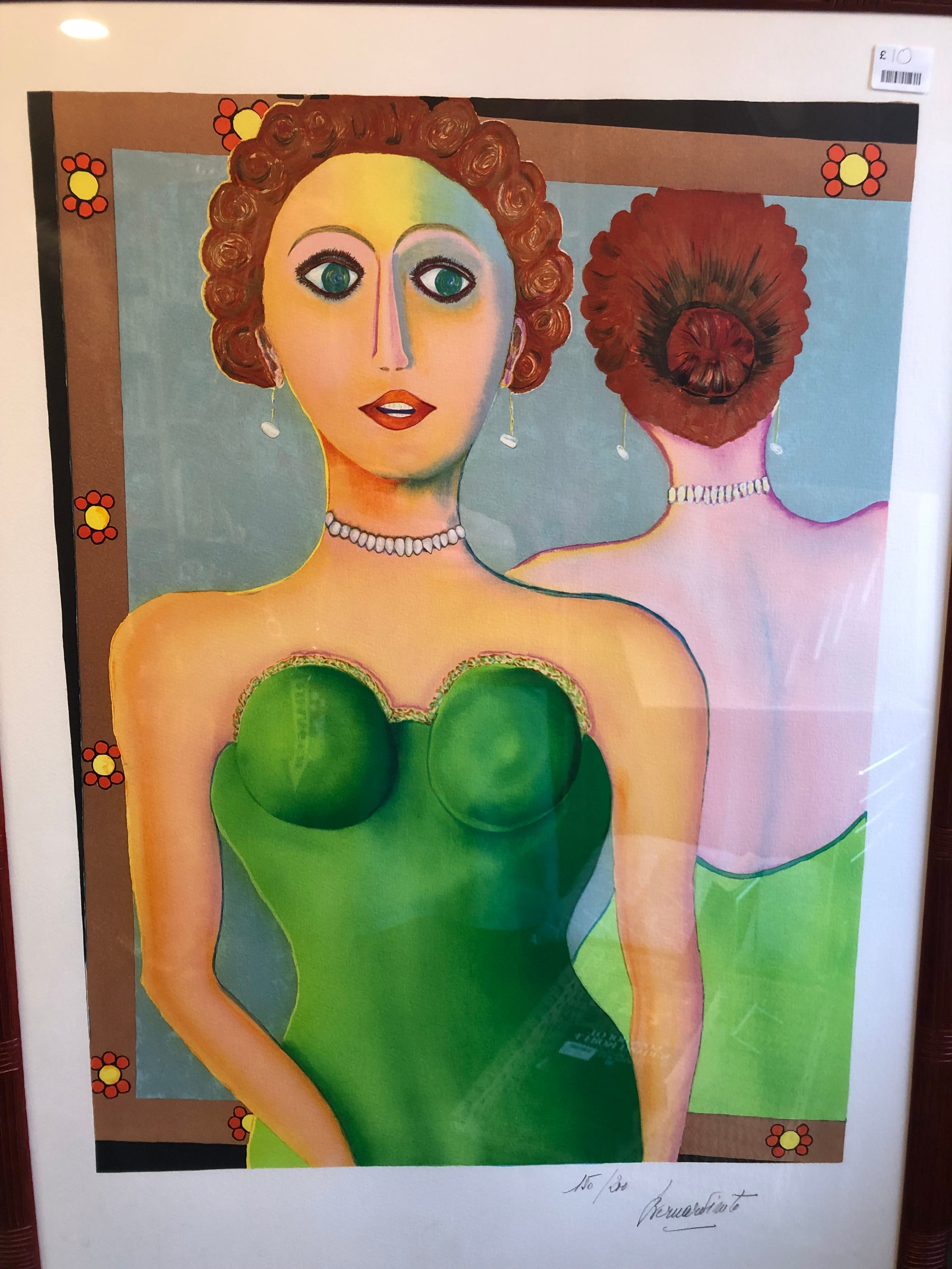
If found this beauty in the charity shop and it does make me ask questions. Ones like what are the boobs doing up there? Did they really sell 150 copies of that? I don’t like it but they’re still charging 10 quid for it.
What do I think makes good art? A painting that deserves a wider audience? I think probably it’s a painting that has something meaningful to communicate, and is doing what the artist wants it to do, that is to say, it communicates effectively to at least some people looking at it. By my definition, Stanley Donwood is doing fine. People want to see the work (the exhibition is popular) the work has things to say, and the paintings look as the artist intended, ie, the paint is not falling off the canvas, and the style of the work is not an accidental thing caused by an inability to draw. Stan can draw if he wants, we can see that in the sketchbooks.
The thing that really boils my piss upset me, which really sets it out as a mean little review, is claiming these paintings ‘wouldn’t even get into the RA summer exhibition’
I think that line really shows the problem at hand, with word even. Because it’s hard to get into the RA summer exhibition, and people are rightly proud when they do. It’s a prestigious event that people are happy to participate in. What the hell is the problem with the Royal academy summer show?
Probably that anyone can enter. The riffraff. The hot polloi. The unqualified. The unwritten sentiment is that good art is made by proper artist with studios and minions to do the work for them, not regular people or, god forbid, people that happen to be mates with one of the countries top bands. I hate this as some of my favourite drawings are by children, and I’m a big fan of outsider art, I love an amateur, and think everyone should have a go, and if their work fulfils my requirements of having a cohesive body of work that has a narrative that people are interested in hearing, an exhibition.
Stanley Dogwood and Thom Yorke have collaborated for years, inventing an interesting visual language and world to create a visual identity for the band that I found fascinating to see in an exhibition. I like Thom Yorke’s music and that was the primary reason I was there, but to say I wouldn’t have been interested without that cannot be proved. I’m quite fond of artists that create thier own universes, and most of them aren’t attached to a band I like. Also, I must point out the W.A.S.T.E website was not officially connected with radiohead for quite a long time and still managed to tick along so there clearly were people interested in the art without being a fan of the music.
Stanley’s work is so intertwined with the music that separting them doesn’t even make sense. The art with out the music would be something else. Maybe paintings that snobby little Guardian critics think are good, who knows.
The whole review has a bitterness to it; it mistook the exhibition as for ann art show, and it’s angry that an artist they see as inferior has undeserved opportunities. It’s snobbery, and I don’t like that. Don’t let it stop you visiting if you’re a fan, and if you are not but know fans then the little shop next to the gallery has loads of Radiohead treats you can get them without paying to see the actual show.
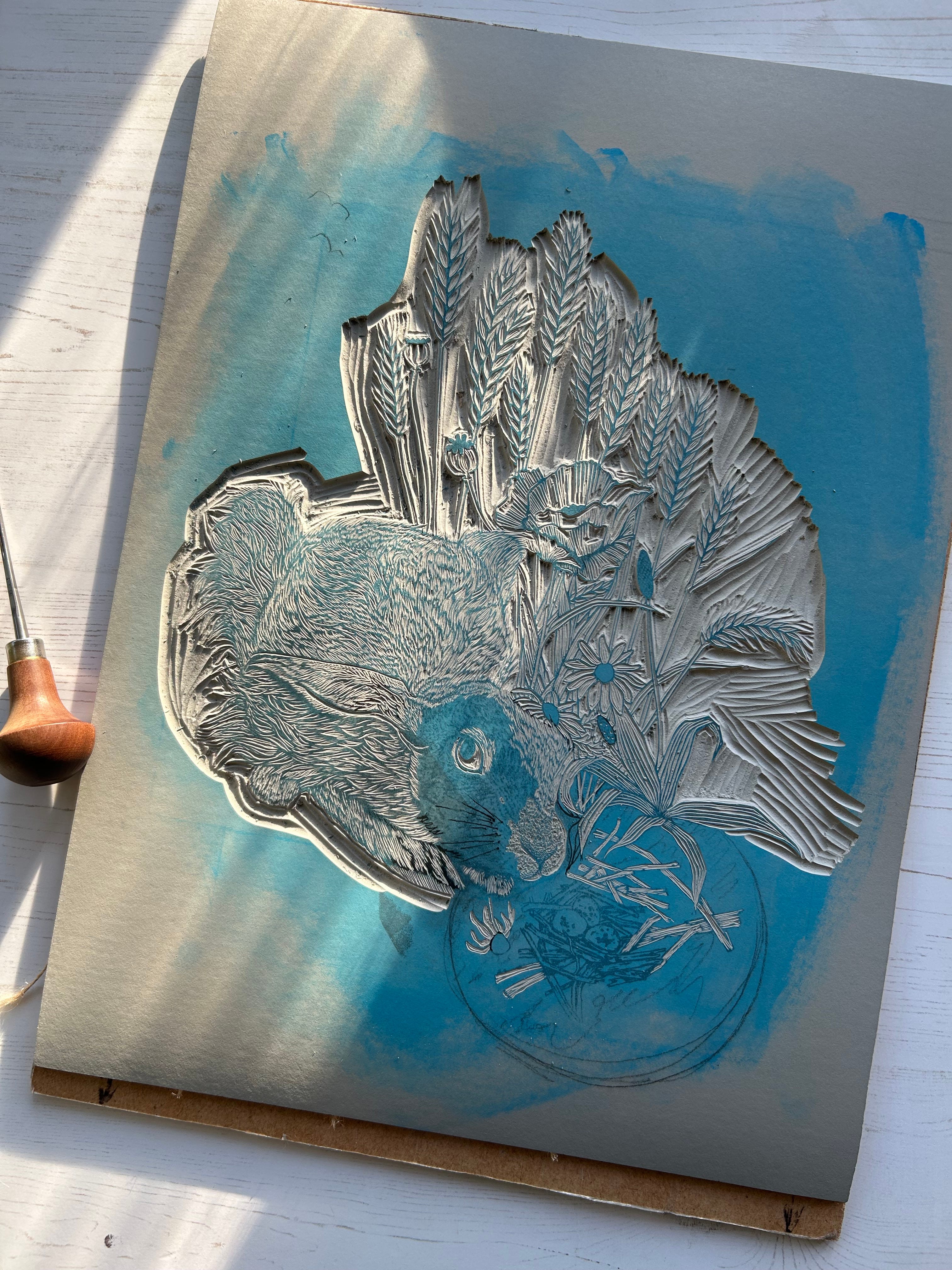
Workings.
I’ve been ‘a couple of days off finishing’ this all week. It’s becoming very obvious I will not be printing this before term breaks up next week and I am forced to devote myself to festive cheer. Forced, I tell you.
Also I’ll have a print (the feet one) in the FOG group show in London open Thursday to Sunday 11-6 till the 14th of December, so if you fancy having a looksie for presents then the address is Brixton railway arch 18, Valentia place SW9 8PJ
Or you can get it direct from me for half the price if you’re sensible here.
I enjoyed your interesting debate on what could make art good or bad. Most of what my partner would choose to display on our walls, had he free rein, I would not classify as good, but he seems to love it. And vice versa, probably.